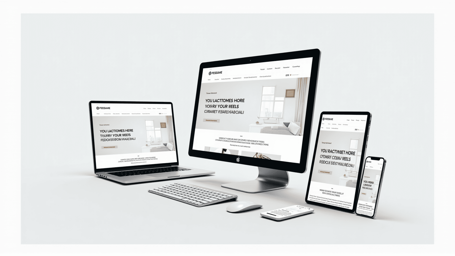
In today's digital age, the internet is accessed through a diverse array of devices, from high-resolution desktops to compact smartphones. This evolution in technology necessitates an approach to web design that can gracefully adapt to different screen sizes and resolutions. Enter the realm of adaptable web creation – a crucial pillar in developing a web presence that is both effective and engaging.
The primary objective of an adaptable web interface is to create an experience that is seamless across all devices. Whether a user is navigating a website on a large computer monitor, a tablet, or a mobile phone, the website should maintain its functionality and aesthetic appeal. This ensures that users can easily find information, complete tasks, or enjoy content without frustrating navigation issues or distorted visuals.
One of the key techniques involves using fluid grids. Unlike traditional fixed-width layouts, fluid grids are designed to be flexible, allowing components of the website to adjust in size relative to one another based on the screen size. This flexibility ensures that images, text, and other page elements scale smoothly, avoiding overlap or cutoff across different devices.
Another vital element of adaptable design is the use of flexible images and media queries. Flexible images adjust their size according to the display, while media queries allow designers to apply different styling rules based on the device's characteristics. For instance, a media query might apply one style for screens smaller than 600 pixels and another for larger screens, ensuring the best possible experience on each.
Moreover, touch-friendly navigation must be considered. On smaller devices, users rely heavily on touch inputs rather than mouse clicks. Therefore, buttons and navigational elements should be designed to be easily tappable, making interaction intuitive and pleasant for users relying on their fingertips.
Additionally, ensuring fast loading times across all devices is crucial. Techniques such as optimizing images, leveraging browser caching, and minifying code help streamline the loading process, providing users with speedy access to information without long waiting times.
The adaptability of a website is no longer just an option; it is an expectation. Users will likely abandon a site if it fails to load correctly on their device, leading to lost engagement and potential opportunities. By prioritizing the creation of web interfaces that are functional and visually pleasing across diverse devices, businesses can ensure a positive and inclusive user experience for all visitors, regardless of how they access the internet. Through careful planning and execution, adaptable design achieves not only aesthetic goals but also enhances overall user satisfaction and accessibility.