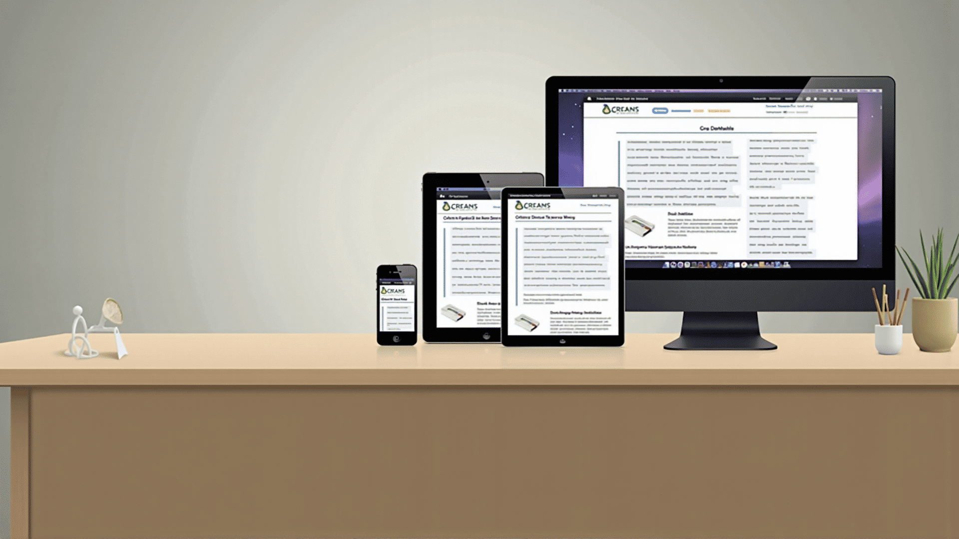
In today's digital age, web designers face the challenge of ensuring that websites are not only visually appealing but also functional across a variety of devices. This is where responsive web design comes in. It's a technique that enables web layouts to adapt seamlessly to different screen sizes and orientations, providing an optimal viewing experience for users on desktops, tablets, and smartphones.
Responsive web design relies on three core components: flexible layouts, media queries, and flexible media.
Flexible Layouts
Flexible layouts are central to creating responsive designs. By using relative units like percentages instead of fixed units like pixels, designers can create grids and elements that adjust smoothly as the screen size changes. For instance, a column in a layout that takes up 50% of the browser window on a desktop will also take up 50% on a tablet, albeit with a different physical width.
Media Queries
Media queries are CSS techniques that allow designers to apply styles based on the characteristics of the device rendering the content. These include parameters such as width, height, resolution, and orientation. By using media queries, designers can tailor the aesthetics and functionality of a site to different devices. For instance, a site might display a horizontal menu on larger screens but switch to a vertical or hamburger menu on smaller screens.
Flexible Media
Images and videos are also crucial elements that need to adapt to different screen sizes. Using CSS, designers can ensure that media scales appropriately within flexible layouts. This is often accomplished by setting media to a maximum width of 100%, allowing it to resize within its container. This helps in maintaining the aspect ratio and avoiding distortion.
Enhancing User Experience
The ultimate goal of responsive design is to enhance the user experience by providing a seamless interface regardless of where or how visitors access a site. Adaptability ensures that users can easily navigate and interact with the site without encountering awkward layouts or functionality issues.
Tools and Testing
Various tools are available to facilitate the process of crafting responsive designs. Frameworks like Bootstrap and Foundation offer predefined grid systems and components optimized for responsiveness. However, it's crucial for designers to engage in thorough testing across a range of devices and browsers to address any inconsistencies and optimize performance.
Incorporating responsive web design practices not only improves accessibility but also future-proofs websites against the rapidly changing landscape of digital devices. By embracing flexible layouts, media queries, and adaptive media elements, designers can deliver consistent and enjoyable user experiences, fostering greater satisfaction and user engagement across all platforms.